Workspace and item breakdown
Which teams and which items are spending the capacity you pay for. It sits under the chart on the Fabric Capacity Usage page in Soterre, as What used the capacity.
By workspace
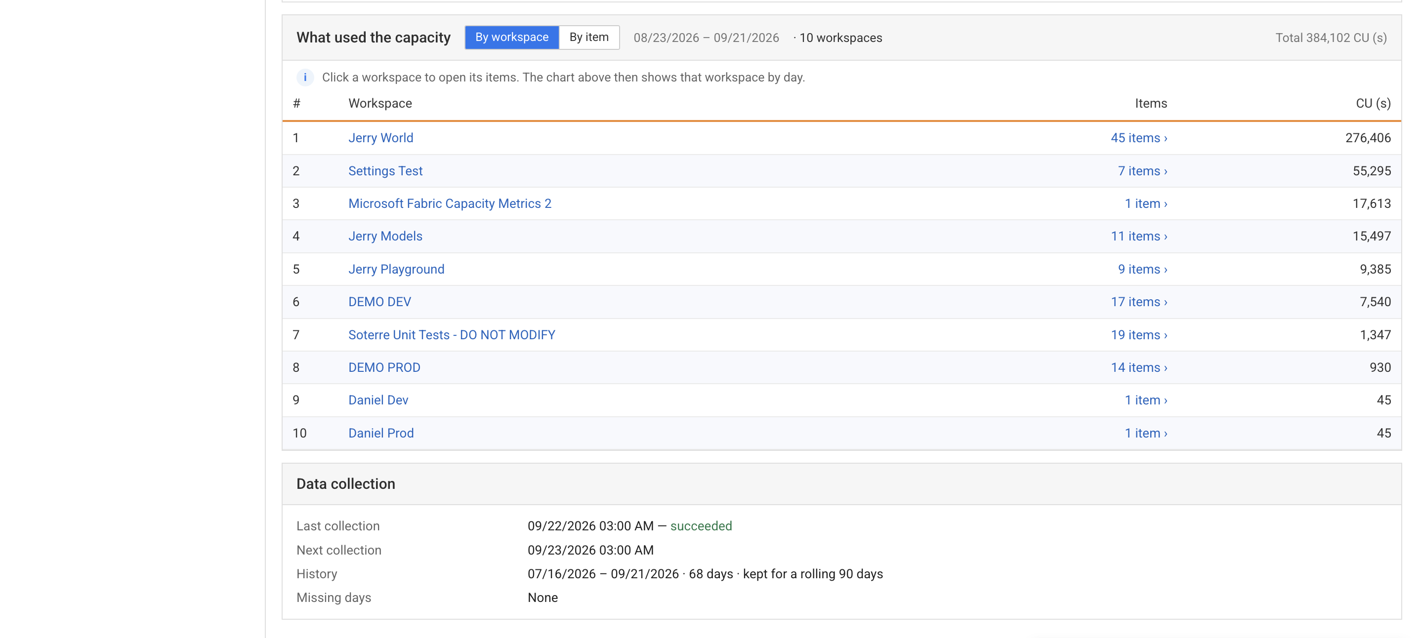
Workspaces ranked by CU over the selected window, with how many items each holds. Workspaces usually map to teams, which makes this the view that turns into a conversation.
Click a workspace to open its items. The chart above then redraws for that workspace alone.
By item
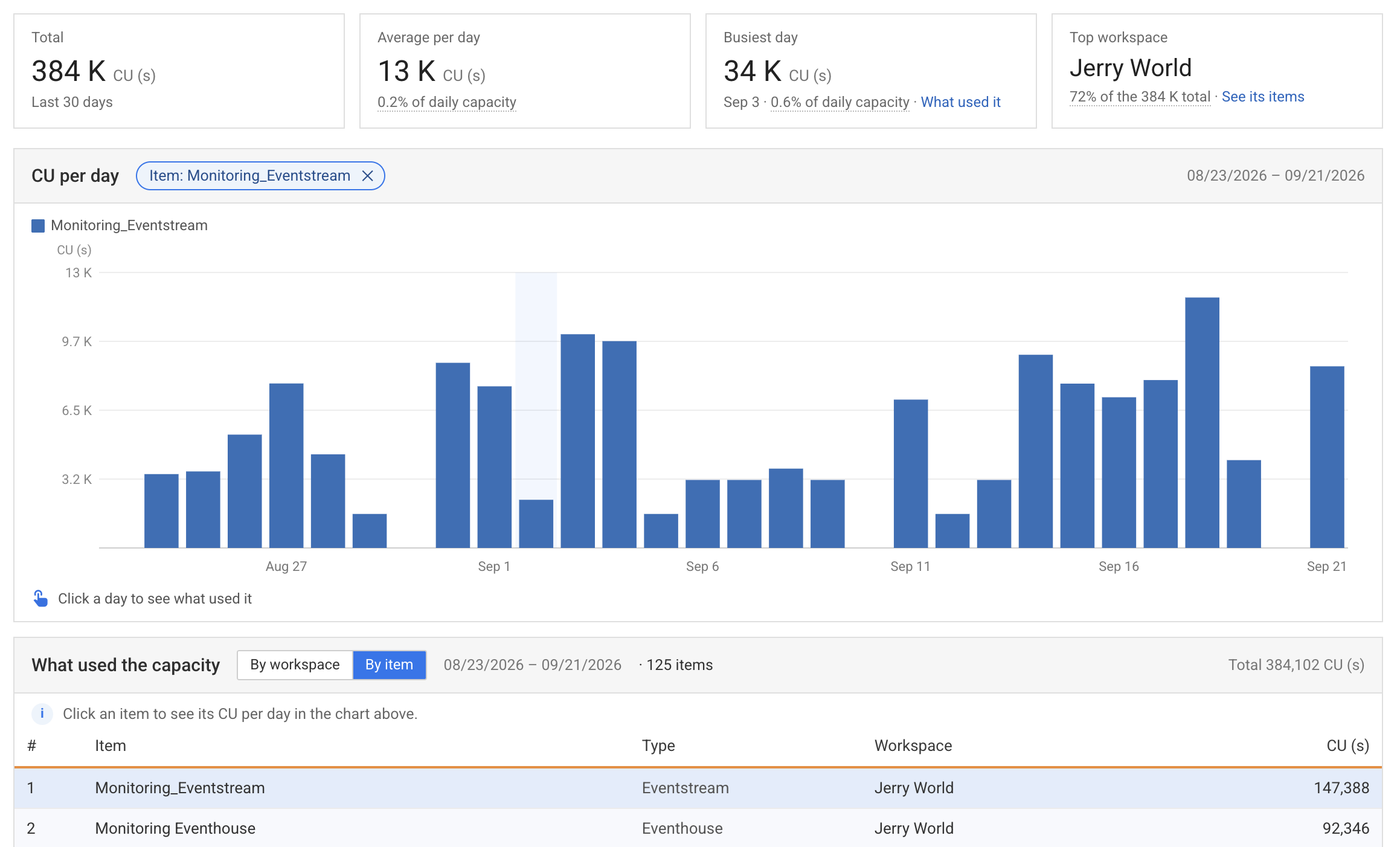
Every item on the capacity, ranked by CU, with its type and workspace.
Click an item and the chart above filters to it, showing that item's CU day by day. The chip above the chart names the filter; the ✕ on it clears the filter and returns to the whole capacity.
This is how you get from the capacity spiked on Tuesday to this eventstream did it.
Consumption is concentrated
Sort by CU and read the top five. On most capacities a handful of items account for most of the usage, and they are where optimization pays.
What the columns mean
| Column | |
|---|---|
| Item, Type, Workspace | What it is and where it lives. Saved at collection time, so deleted items stay readable |
| CU (s) | CU-seconds used over the window |
A dash instead of a number means the value was never measured, which is different from zero. See what Fabric publishes.
Data collection
Below the table, Soterre reports the state of collection for this capacity: when the last collection ran and whether it succeeded, when the next is due, how much history is stored and over what range, and how many days are missing.
Missing days are gaps the collector can no longer fill. See an interruption has a deadline.